corporate brand identity design
Duke Energy Sustainable Solutions
Duke Energy Sustainable Solutions (DESS) was the result of a merger of REC Solar, Duke Energy Renewables (DER), and Duke Energy One (DEO). It consolidated Duke Energy’s commercial renewable energy offerings and DESS needed an identity separate from the utility to clarify offerings for potential customers and regulatory agencies.
Duke Energy maintains tight brand control over all subsidiaries. Elements like the logo, type, and most of the palette were set in stone. Additional elements would require approval by the internal marketing and design group, who were used to moving at utility pace and were unfamiliar with renewable commercial sales.
REC Solar was the first company owned by Duke Energy to maintain a separate brand because it had a distinct name. Because we were experienced with commercial sales and more nimble than the internal marketing and design group, and our divisions frequently worked together, my team was used like a boutique agency by DER and DEO. For over a year we balanced the identities of three companies with different offerings and audiences. Creating a unified identity was the culmination of my previous work, and the next step in creating a stronger, joined public image.
The desired theme of the new brand was “Smart. Scalable. Sustainable.” This referred to cutting edge renewable energy being suitable for any size commercial business. I wanted to extend this to the brand elements as well - simple elements that could be easily scaled, and contributed to their position as a thought leader within the renewable energy industry.
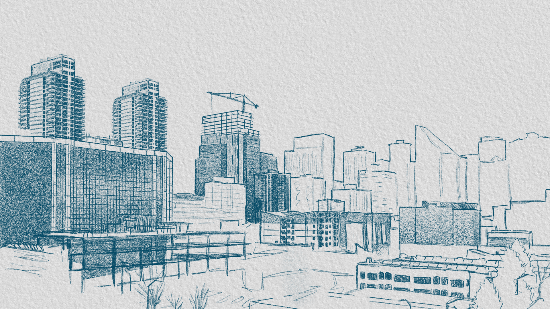
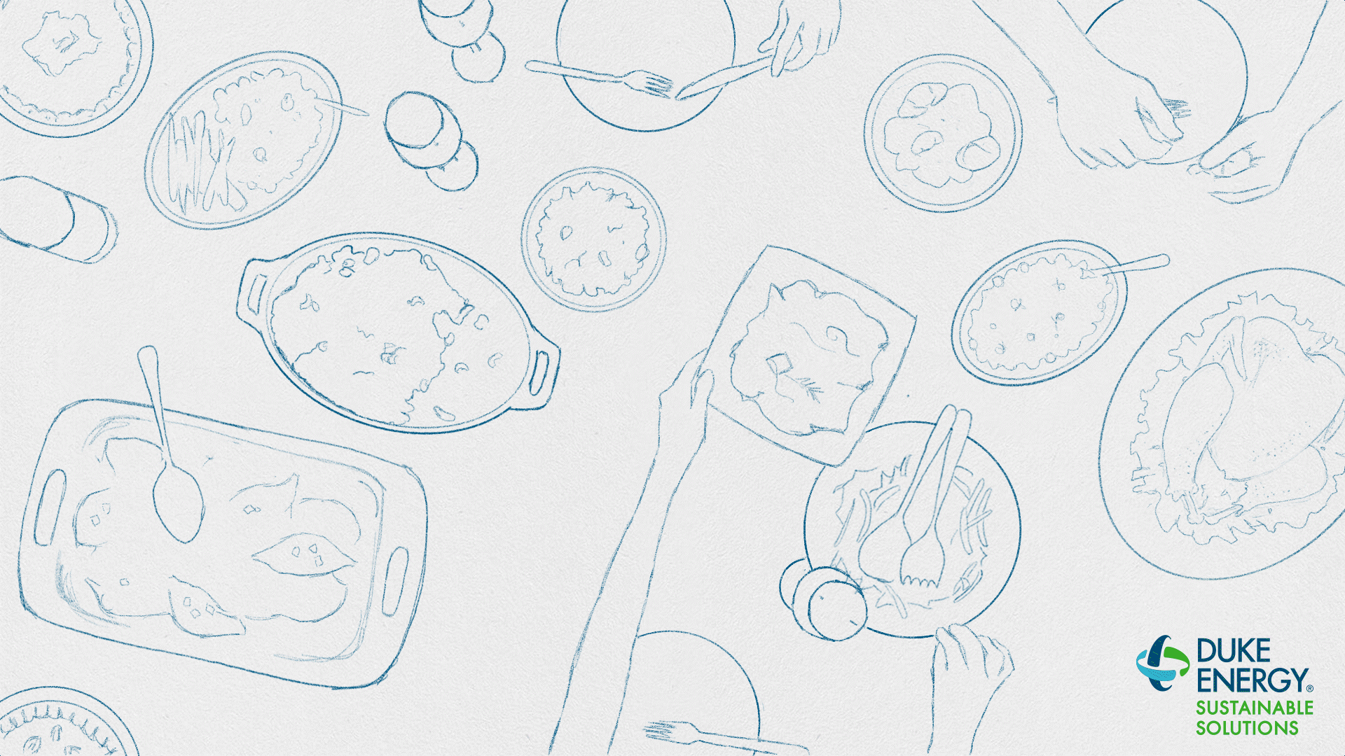
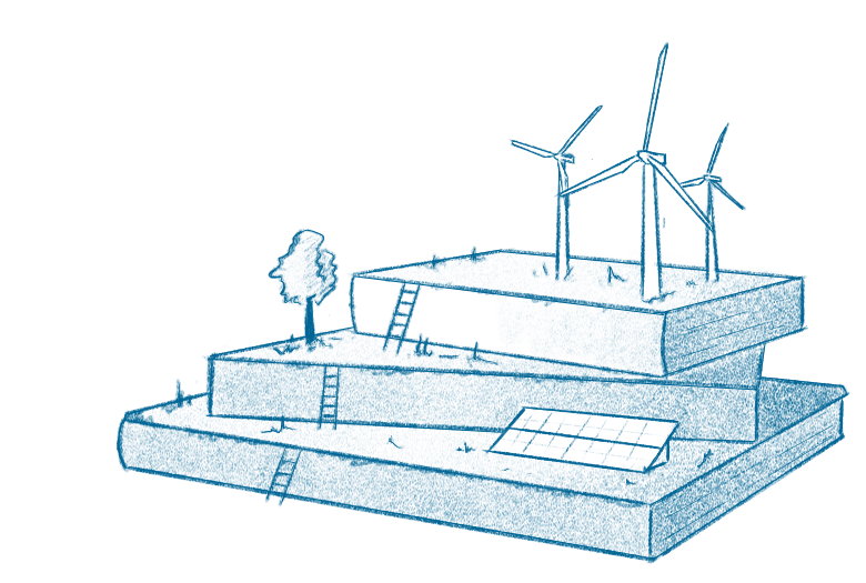
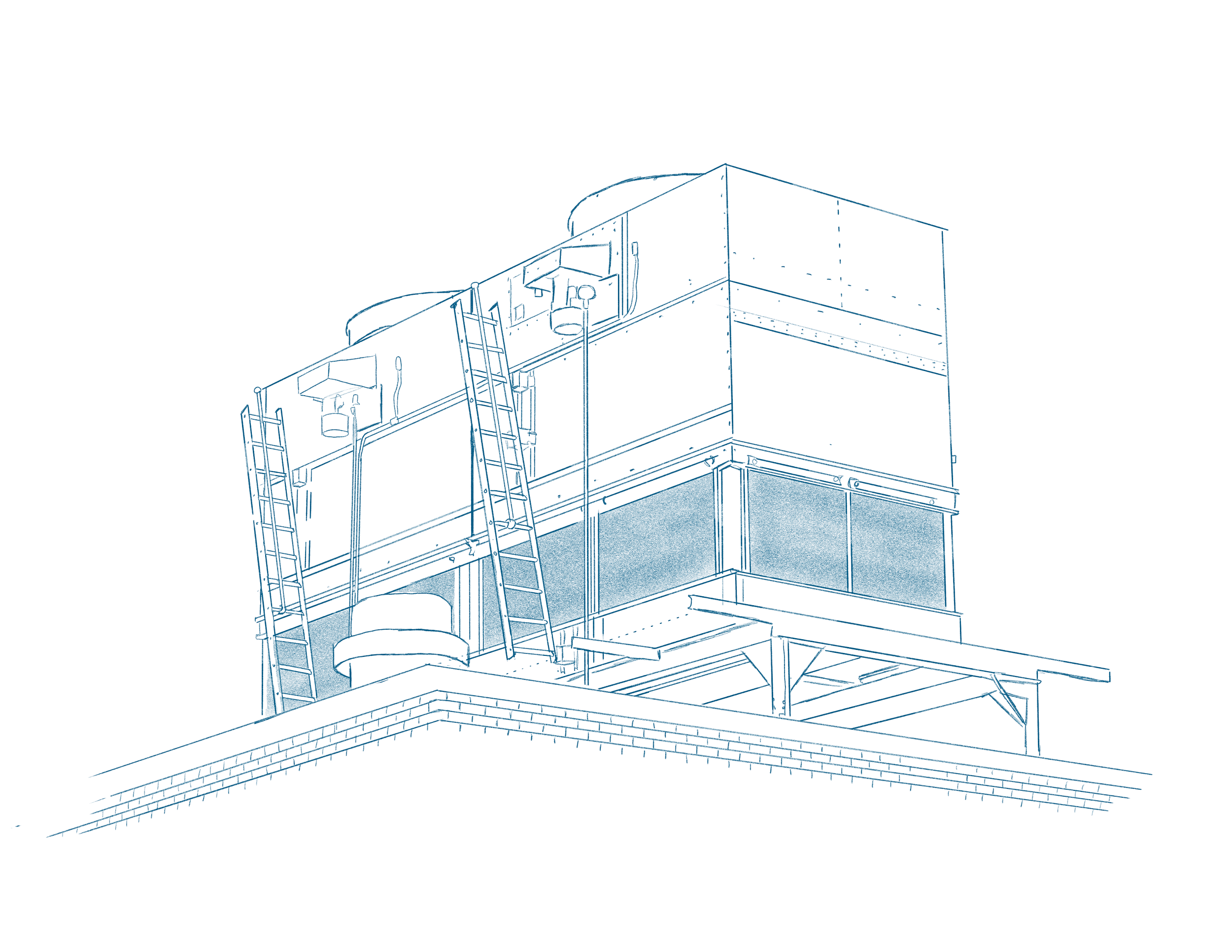
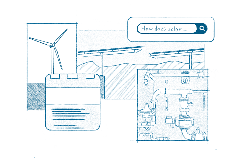
One of my scribbles of a wind turbine caught my team’s attention, and they encouraged me to explore the idea. An artistic theme is far from common in the energy sector, & would set DESS apart as a creative and thoughtful energy partner.
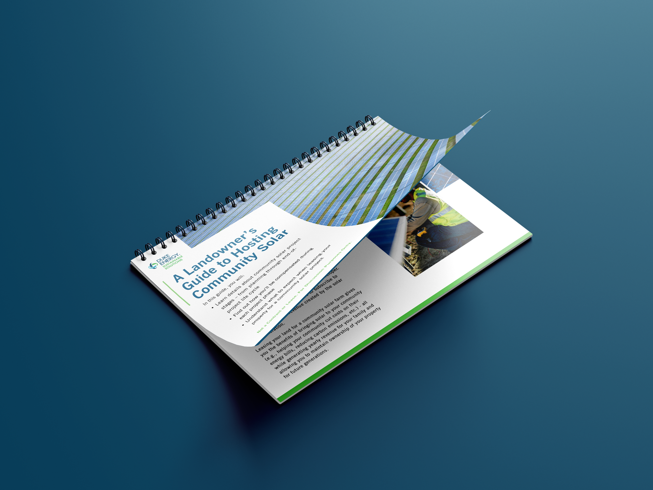
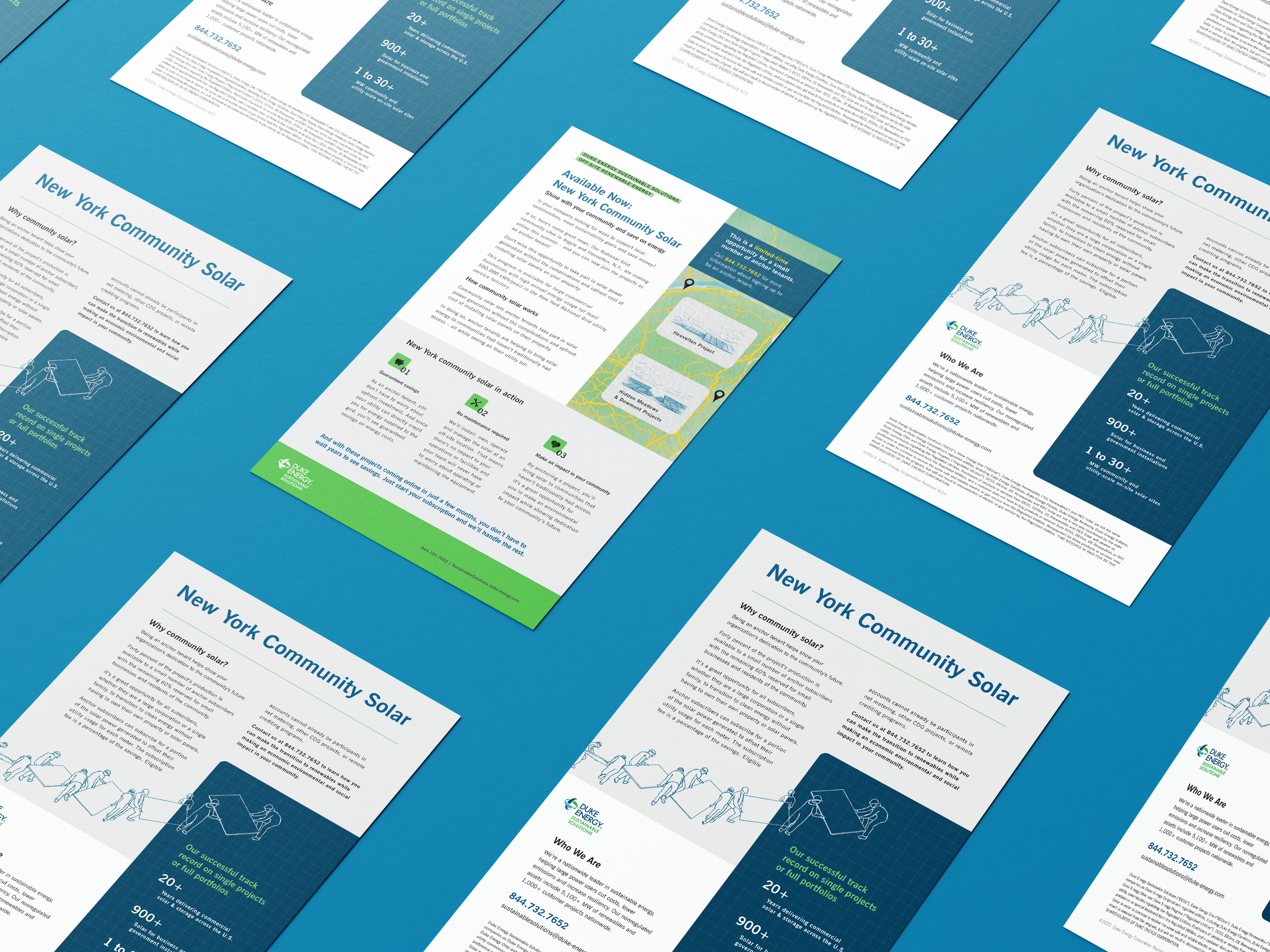
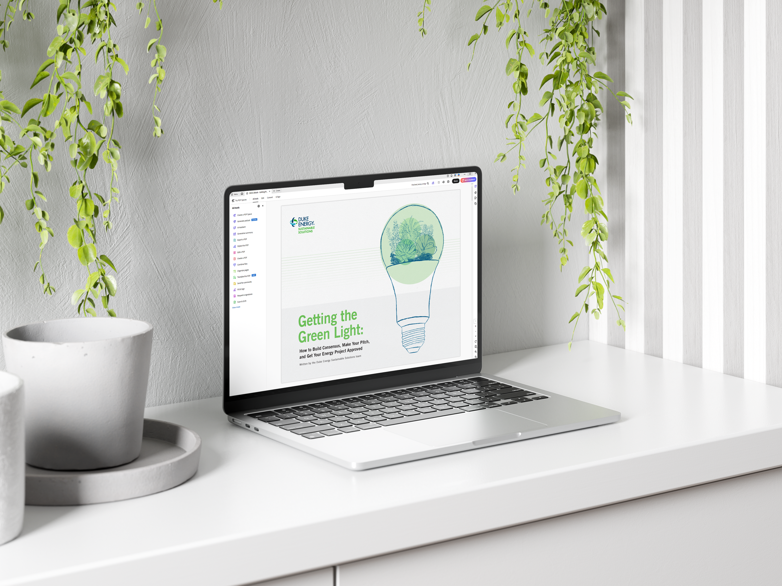
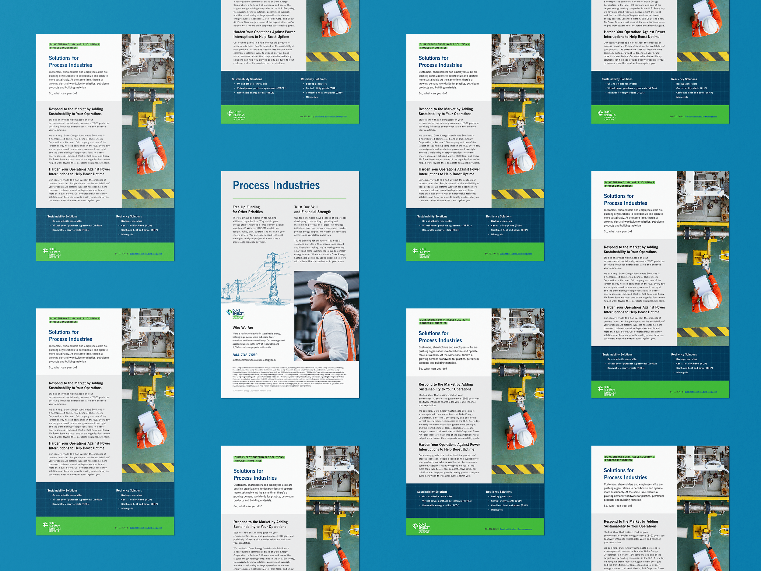
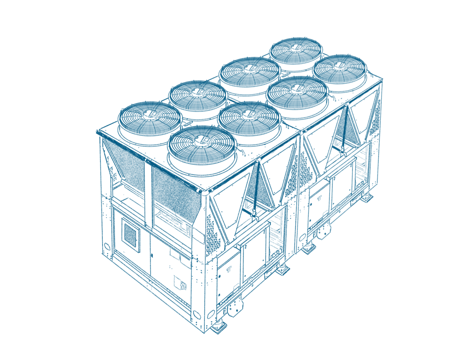
Over 2020, our team of eight people in three states over six time zones collaborated to develop the new identity. Duke Energy allowed me to introduce a pale green and a lighter blue to our palette, adopt blue pencil sketch artwork, and add graph and watercolor paper. We also created DESS list and numbering styles. The website heavily featured my sketches, from the concrete to the abstract.


brand standards
made available to all employees
contains everything, including where resources could be found
An in-house designer creates a lot of collateral, more than should be on a single case study page. Click here to see more collateral examples →