corporate brand identity design
Joules Accelerator
Joules Accelerator is a nonprofit energy startup incubator supported by Duke Energy.
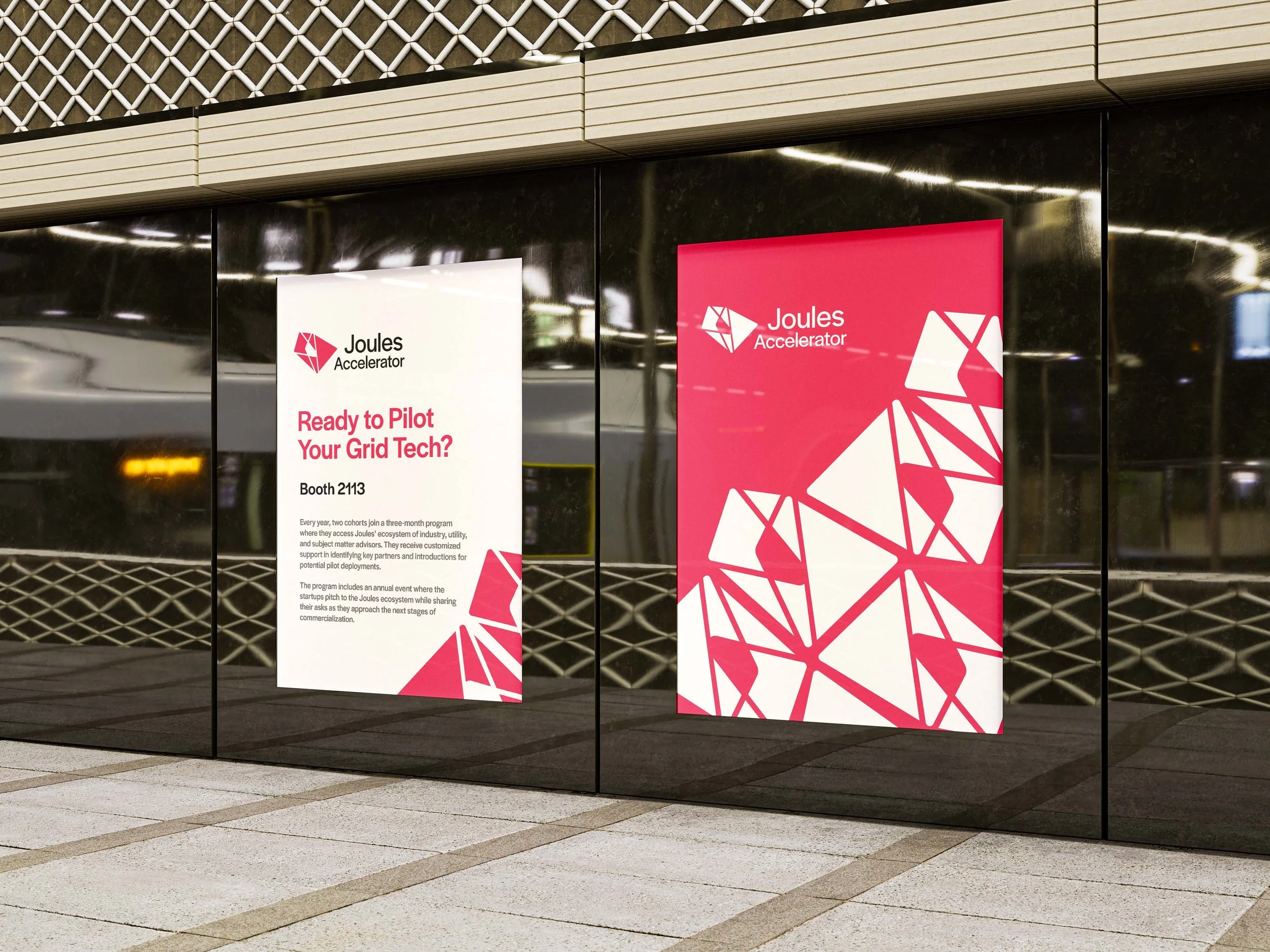
My team was pulled in to help with identity design and provide basic website and writing guidelines. We needed to deliver simple guides that a team of two salespeople could implement on their own.

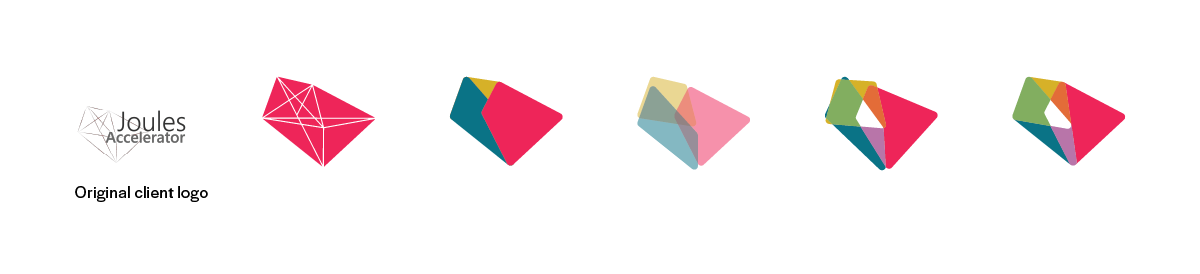
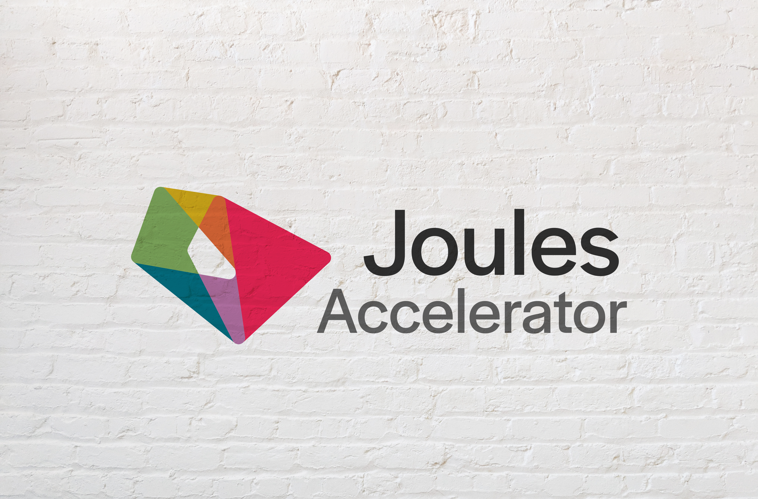
I started with one of the few assets provided - their existing logo. The styling of the logo mark was outdated - but I liked the shapes I could see in it. I played with the original lines: creating shapes, overlapping them, combining colors, and shifting placement. I also liked the right alignment of the text in the primary execution, and that alignment fit with the updated logomark.
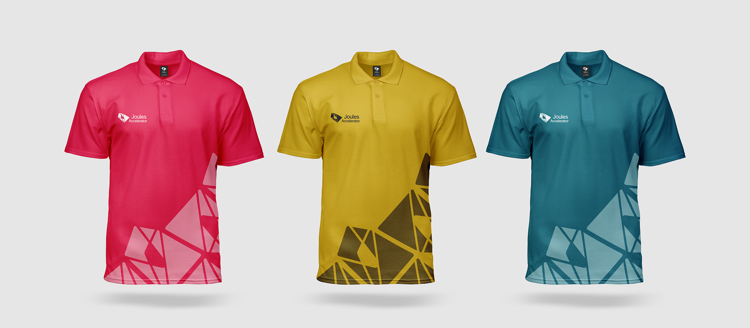
The primary shades - dark blue, mustard yellow, bright red - were inspired by photography Joules was using on their website. Joules runs several sessions a year, and a wide palette - with the addition of orange, green, and purple - gives Joules an easy way to differentiate them.