2000-2020
2023 redesign
corporate brand identity design
REC Solar
REC Solar was one of the first major players in the solar industry. It was known for its strong safety culture and dedication to quality.
After several years of inactivity, REC Solar returned to the market in 2023 with different offerings. The new logo couldn’t be so radical a departure that it couldn’t be recognized; changing REC Solar’s identity could potentially ding 24 years of brand equity when they could least afford it.
This was my opportunity to change the logo based not only on the new direction of the company, but also on challenges it presented in the 7 years I had been working with it.

I started with interviews with a sampling across the company: accounting, project management, engineering. One of the ways REC Solar stood out from others was their retention rate. Many employees had been with REC Solar for at least five years when they were acquired by Duke Energy; a tenure upwards of ten years wasn’t uncommon. Employees who left during the Duke Energy years often asked to stay in touch, in case REC Solar became independent again, because they wanted to return.
Employee buy-in would be crucial to whatever changes I made.
During the interviews, it was clear that everyone was looking forward to getting back to REC Solar’s roots: selling solar in California. The San Luis Obispo office had been full of environmentalists, engineers in flip-flops, and people arriving late or leaving early if there was a good surf report. REC Solar was a stellar example of authentic, quirky California casual, and I wanted to capture that.
REC Solar grew out of a joint senior project by two engineering majors at Cal Poly San Luis Obispo (Cal Poly), embodying the university motto “Learn by Doing”. I wanted to honor that history. For inspiration, I turned to the 1975 National Aeronautics and Space Administration Graphics Standards Manual (Danne & Blackburn) and the 1977 United States Environmental Protection Agency Graphics Standards System (Steff Geissbuhler, Chermayeff & Geismar Associates).

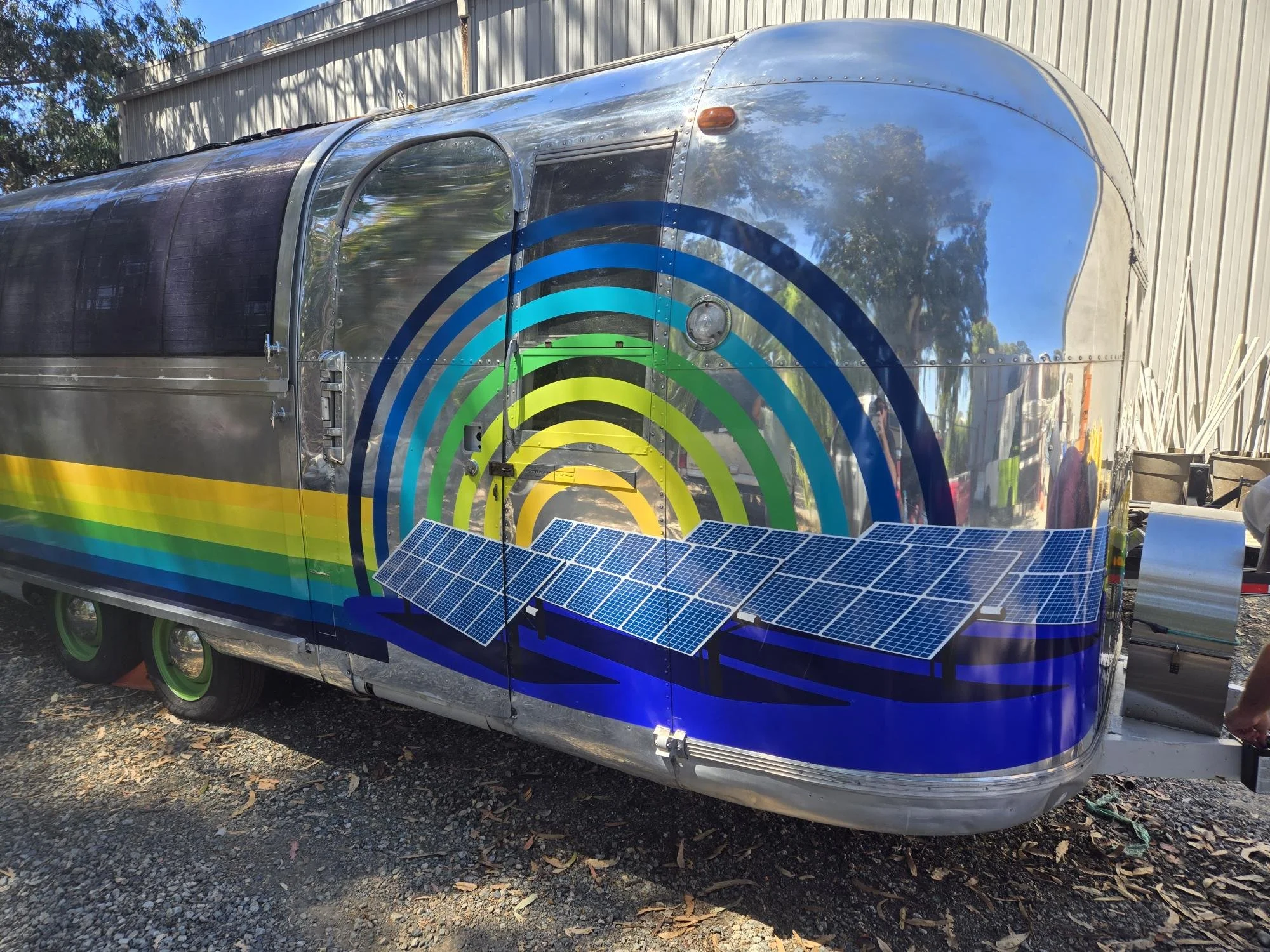





initial pitch
delivered to my boss
contains inspirations, concept, and trends. I was asked to identify trends to follow; I presented them as styles that could be incorporated, phased in and out, or be used for specific campaigns
brand identity proposal
presented to the executive team
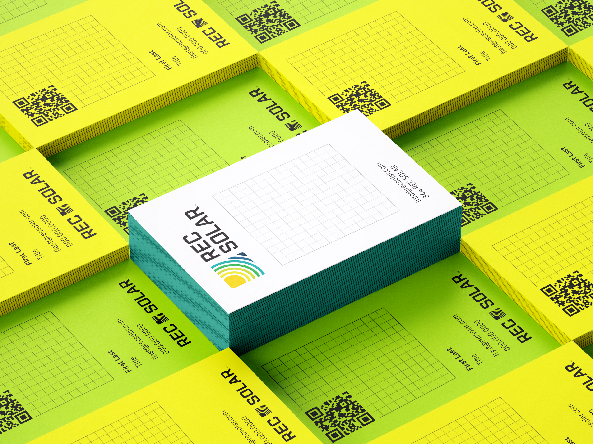
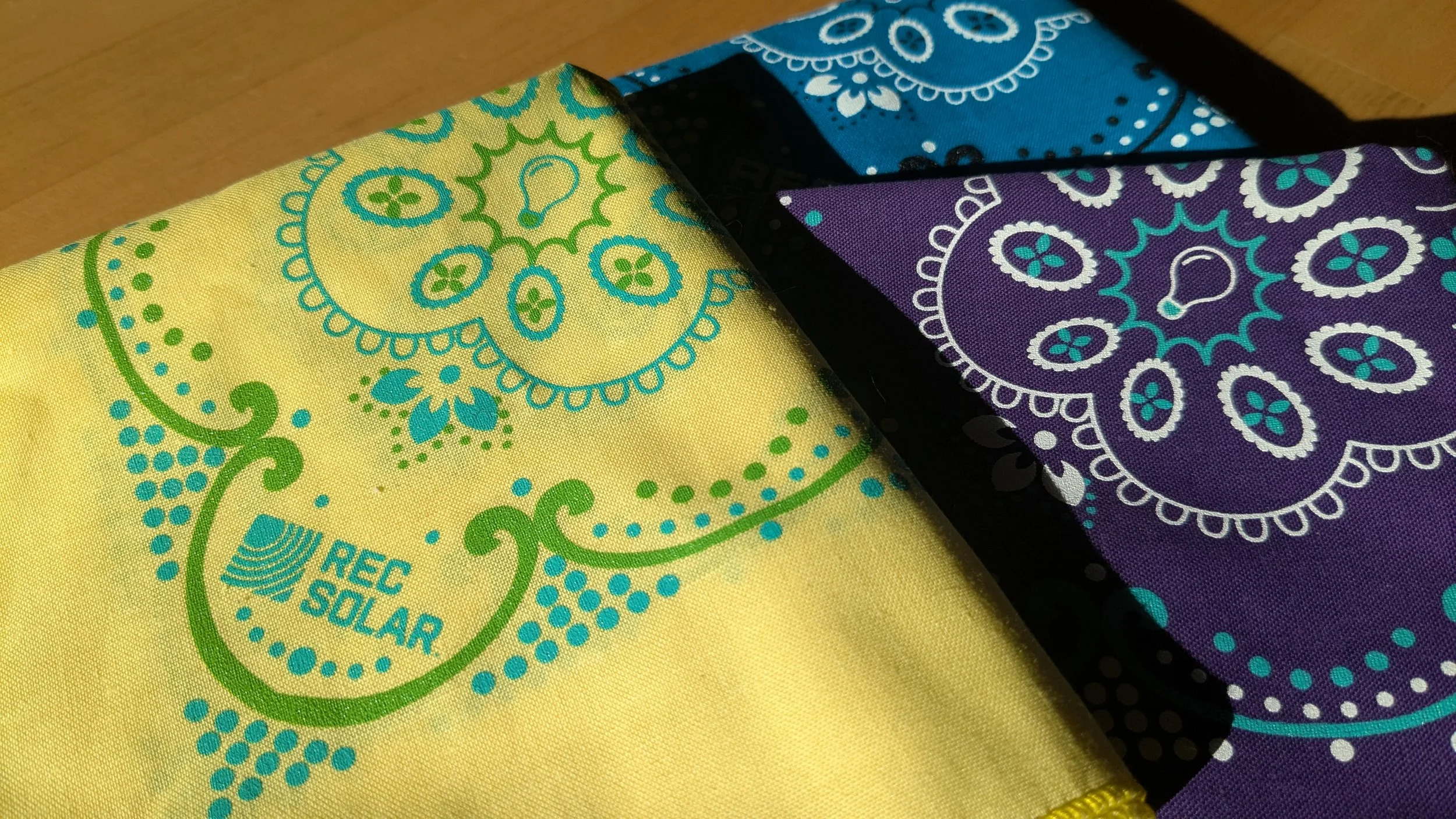
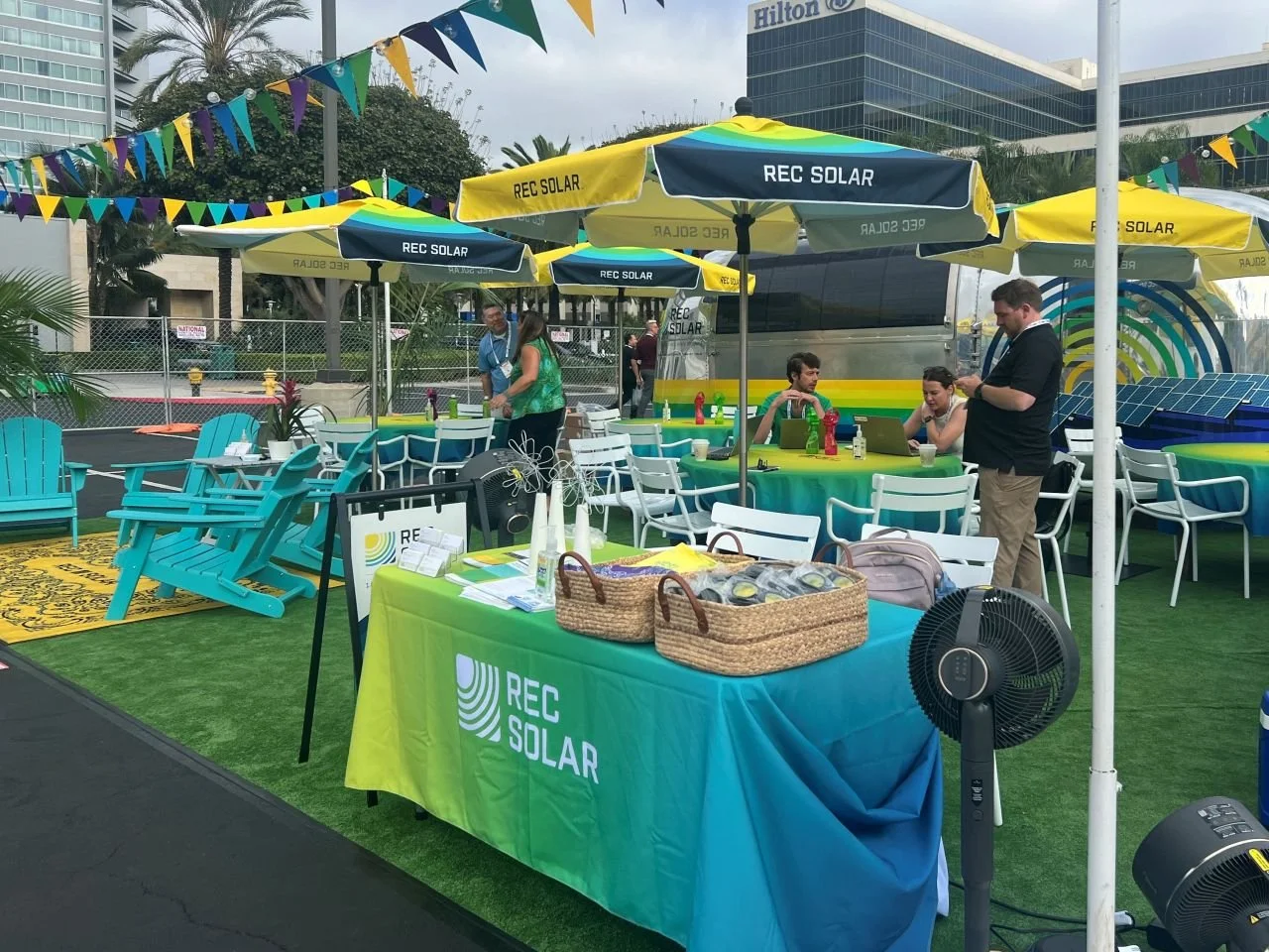
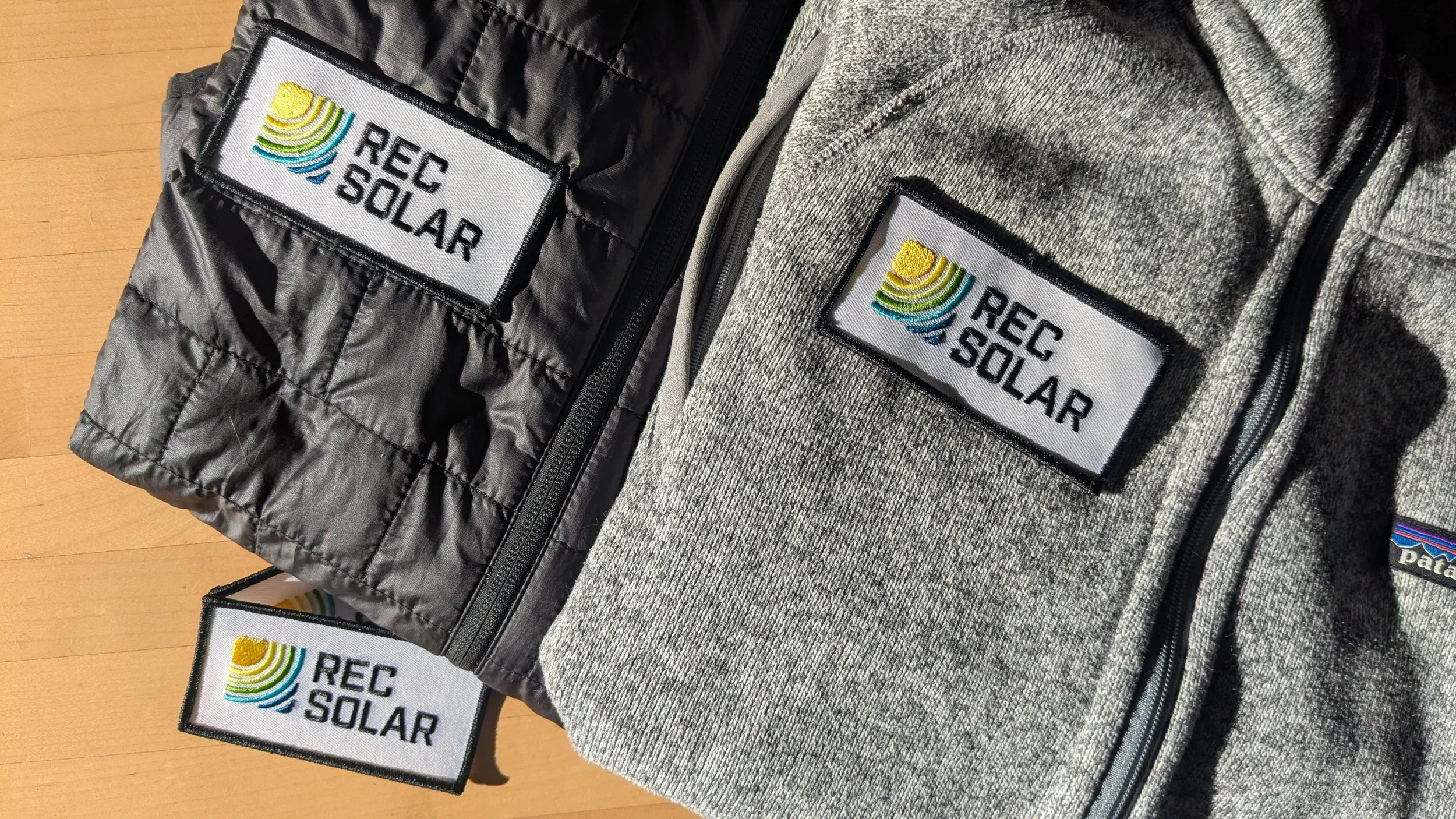
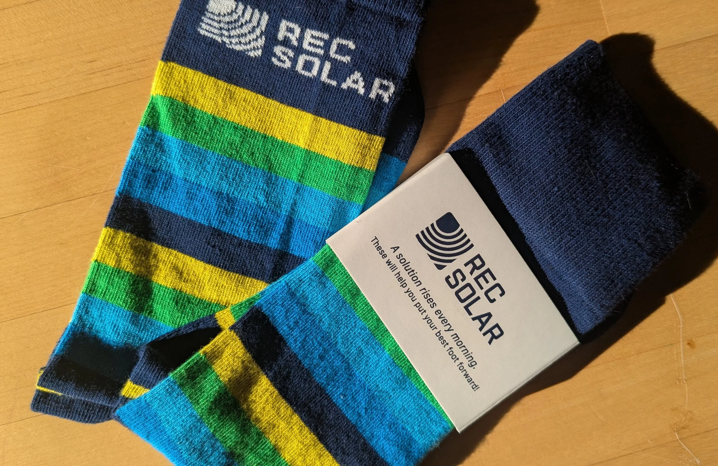
contains messaging, logo, palette, type, launch collateral, sales collateral, stationery, apparel, and promotional items
brand standard
made available to all employees
contains everything, including where resources could be found
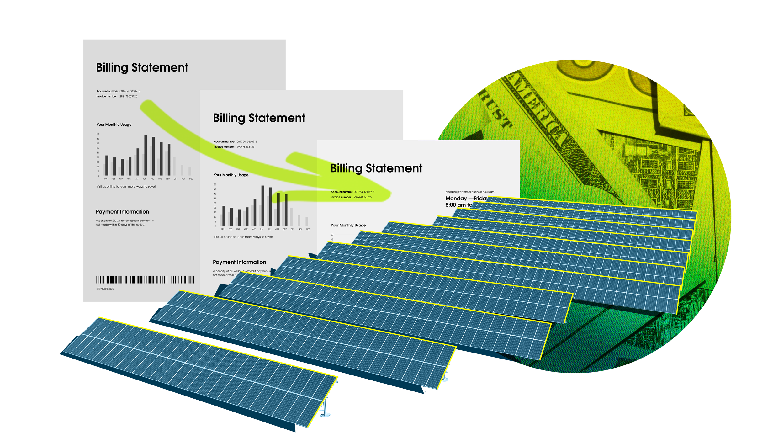
An in-house designer creates a lot of collateral, more than should be on a single case study page. Click here to see more collateral examples →