
Joules Accelerator
Joules Accelerator is a nonprofit energy startup incubator, supported by Duke Energy. My team was pulled in to help with the identity design, and provide basic website & writing guidelines.
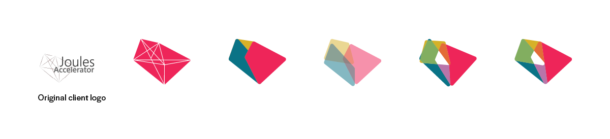
The styling of the logo mark was outdated - but I liked the shapes I could see in it. I played with the original lines: creating shapes, overlapping them, combining colors, and shifting placement. The primary shades - dark blue, mustard yellow, bright red - were inspired by photography Joules was using on their website, and received positive feedback when I used them throughout our design proposal.

I also liked the right alignment of the text in the primary execution, and that alignment fit with the updated logomark.

From the logo I got the brilliant palette. Joules runs several sessions a year, and a wide palette gives them an easy way of differentiating them.
After delivery of the logo, palette, and typeface (Halyard, by Darden Studio), our involvement with the project ended.