Duke Energy Sustainable Solutions
brand identity
Duke Energy Sustainable Solutions (DESS) was the result of a merger of REC Solar, Duke Energy Renewables, and Duke Energy One. It consolidated Duke Energy’s commercial renewable energy offerings.
DESS needed an identity separate from the utility, to clarify offerings for potential customers and regulatory agencies.
Elements like the logo, type, and palette were set in stone. Additional elements would require approval by the internal marketing and design agency, who were used to moving at utility pace and were unfamiliar with commercial sales.
brand standards
made available to all employees

REC Solar was the first company owned by Duke Energy to maintain a separate brand, so balancing the two brands had been a part of my work. Creating a unified identity was the culmination of my previous work, and the next step in creating a stronger, joined public image.
The combined business unit would fall under the Duke Energy brand, which meant that logo, palette, and main typography could not be altered.
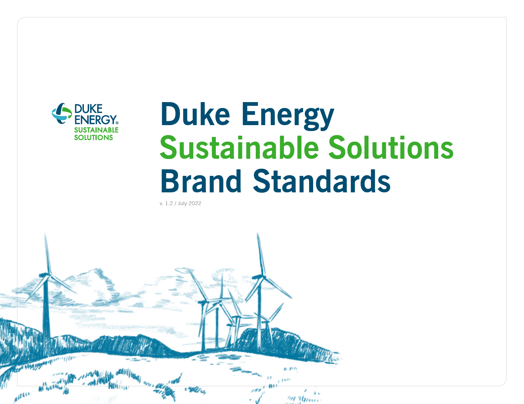
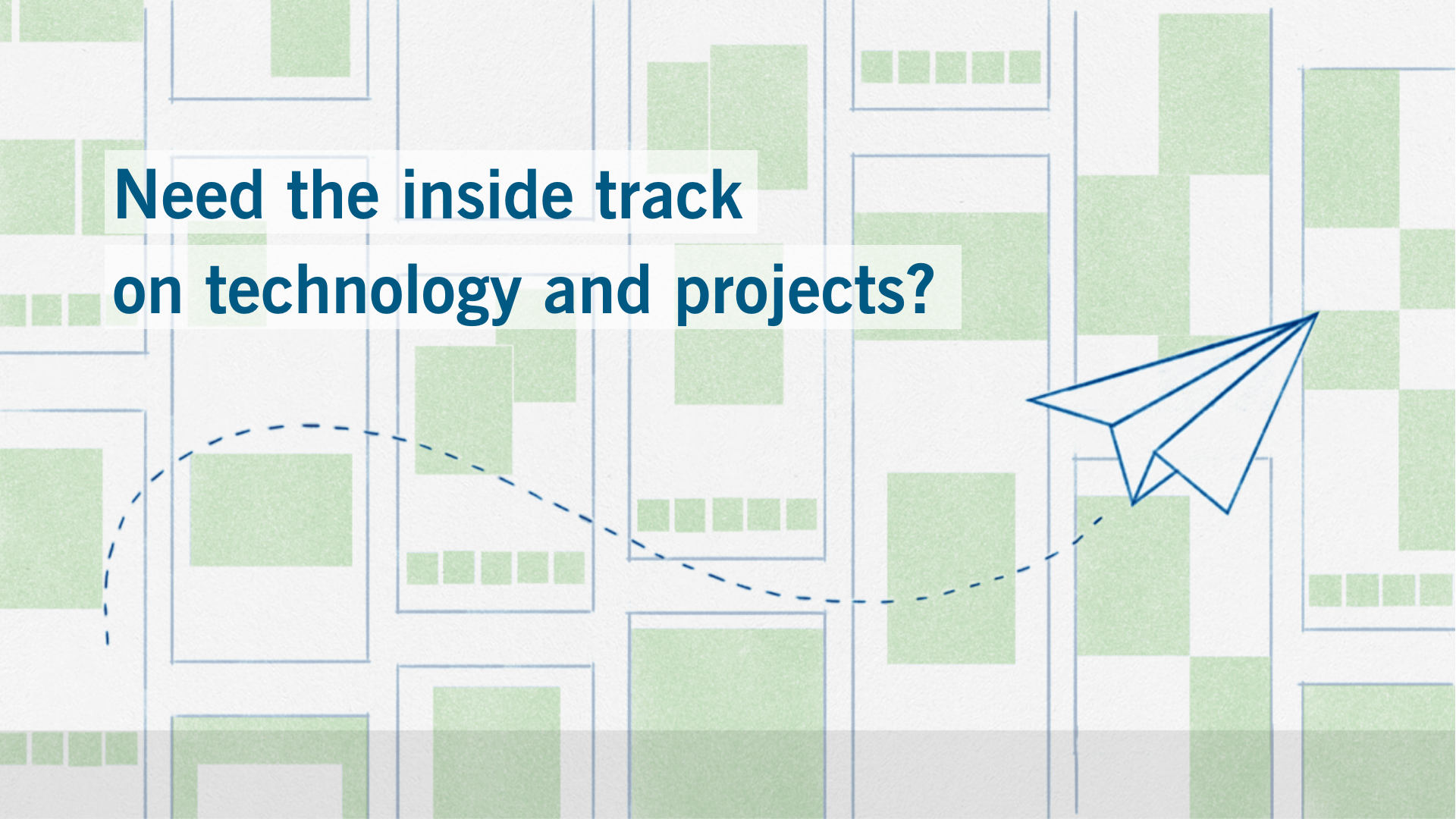
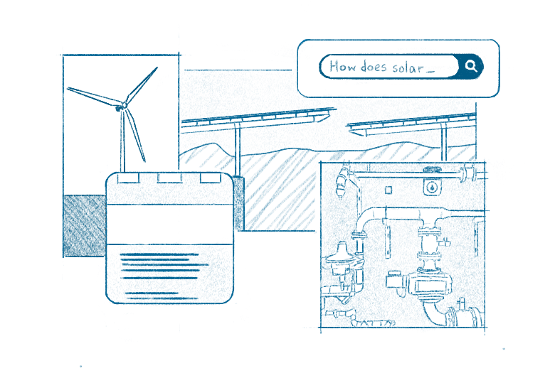
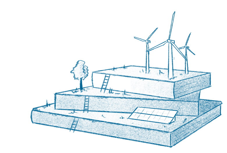
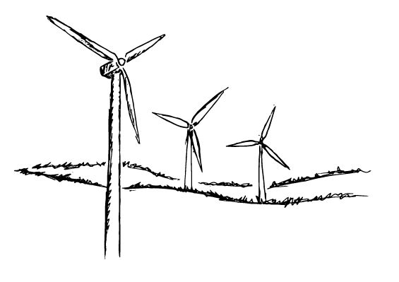
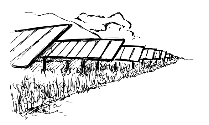
The desired theme of the new brand was “Smart. Scalable. Sustainable.” This refers to cutting edge renewable energy being suitable for any size commercial business. I wanted to extend this to the brand elements as well - simple elements that could be easily scaled, and contributed to their position as a thought leader within the renewable energy industry.
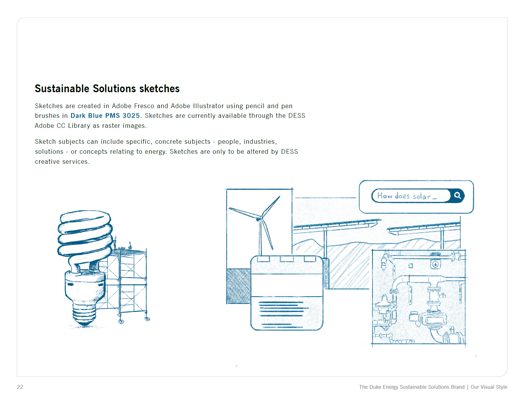
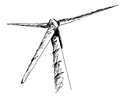
A scribble of a wind turbine caught my team’s attention, and they encouraged me to explore the idea. An artistic theme is far from common in the energy sector, & would set DESS apart as a creative and thoughtful energy partner.